
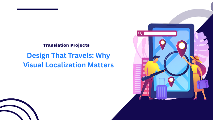
In today’s interconnected world, brands are no longer confined by borders. A design that resonates in one country may fall flat-or even offend-in another. This is where visual localization comes into play. It’s the art and science of adapting visual content-graphics, layouts, colors, and imagery-to suit the cultural, linguistic, and regional nuances of your target audience.
What is Visual Localization?
Visual localization goes beyond simple translation of text. It involves tailoring every visual element of your content so that it communicates effectively across different markets. This can include:
- Colors: Colors evoke different emotions in different cultures. For example, while white symbolizes purity in many Western countries, it can represent mourning in some Asian cultures.
- Images and Icons: Symbols and gestures can have varying meanings. A thumbs-up might be positive in one country but offensive in another.
- Layout and Design Preferences: Reading patterns differ; some cultures prefer minimalistic designs, while others appreciate detailed visuals.
- Typography: Fonts and text placement can impact readability and perception, especially in languages with complex scripts.
Why Visual Localization Matters
- Enhances Cultural Relevance
Localized visuals make your brand feel familiar and trustworthy to local audiences. This strengthens engagement and builds brand loyalty. - Prevents Miscommunication
Misinterpreted visuals can harm your brand reputation. Thoughtful localization ensures that your message is clear and appropriate for every market. - Boosts Global Marketing Performance
When visual content resonates culturally, campaigns perform better. Users are more likely to interact, share, and convert. - Supports Inclusive Branding
Global audiences value brands that respect cultural diversity. Visual localization demonstrates your brand’s commitment to inclusivity.
Key Elements to Consider in Visual Localization
- Cultural Symbols & References: Ensure all images, icons, and illustrations align with local customs and sensitivities.
- Color Psychology: Adapt color schemes to match cultural perceptions and avoid unintended negative connotations.
- Layout & Format: Adjust designs to accommodate text expansion, reading direction, and platform preferences.
- Local Trends & Aesthetics: Research popular design trends in each target market to make your visuals appealing.
Examples of Visual Localization Done Right
- Global Food Brands: McDonald’s adapts menu images and packaging to reflect local tastes and cultural norms.
- E-commerce Platforms: Amazon alters website layouts and imagery to match regional shopping habits and user expectations.
- Streaming Services: Netflix modifies promotional graphics and thumbnails to suit local languages, cultures, and viewing preferences.
Conclusion
Visual localization is no longer optional for brands aiming to go global-it’s essential. A well-localized design speaks the language of your audience without words, resonates emotionally, and fosters trust across borders. In a world where attention spans are short and competition is global, design that travels can be the difference between being noticed and being ignored.